
Soda Can Package Design
Soda Can Package Design
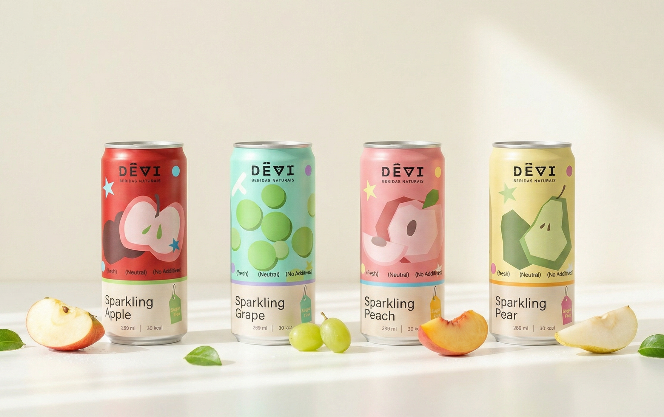
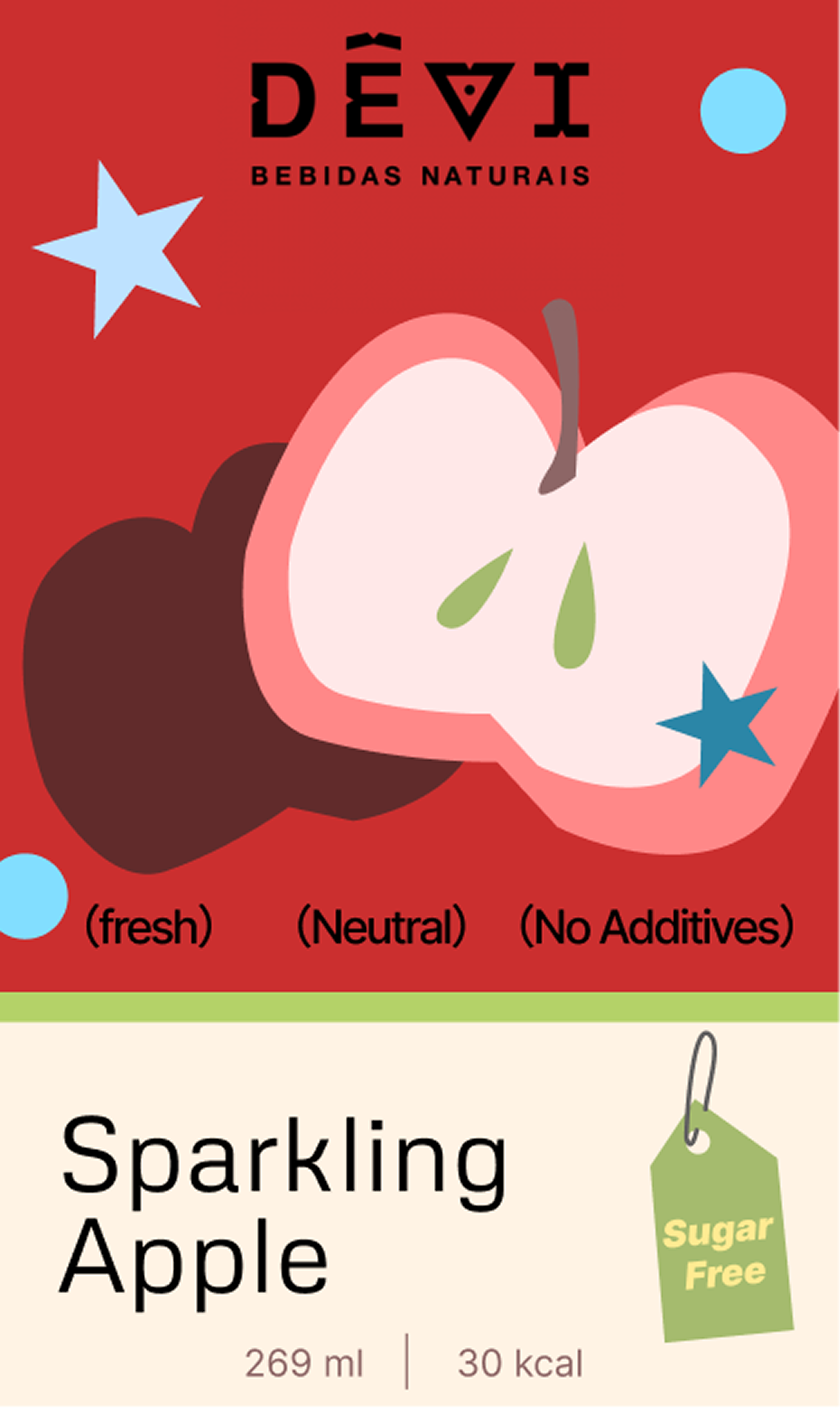
This packaging redesign reimagines DEVI’s soda cans through bold color blocking and simplified fruit illustrations to highlight different flavors. Each can has its own visual identity while staying consistent within the overall brand system. The project explores how shape, color, and graphic composition can create a playful and cohesive packaging series.
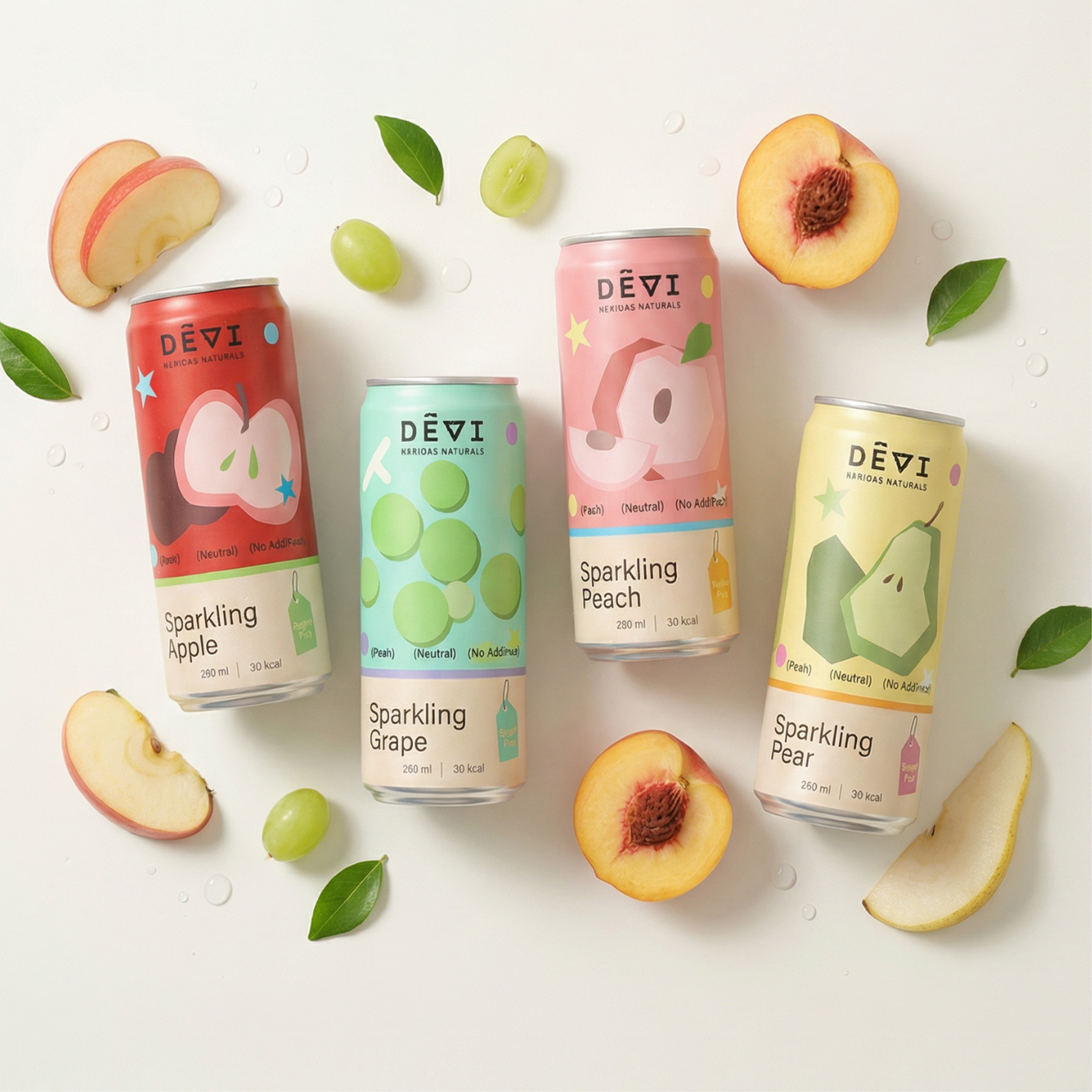
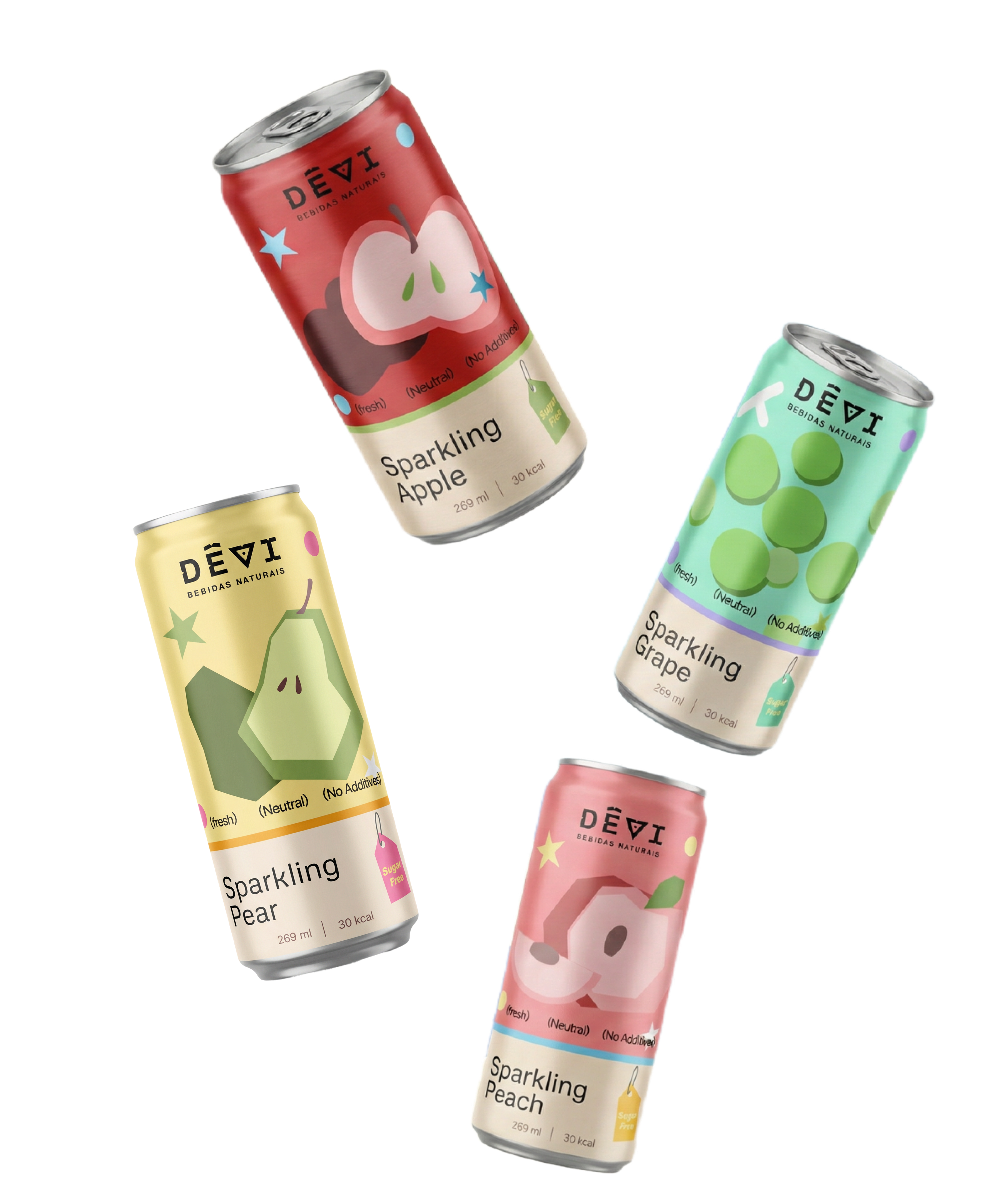
Package details
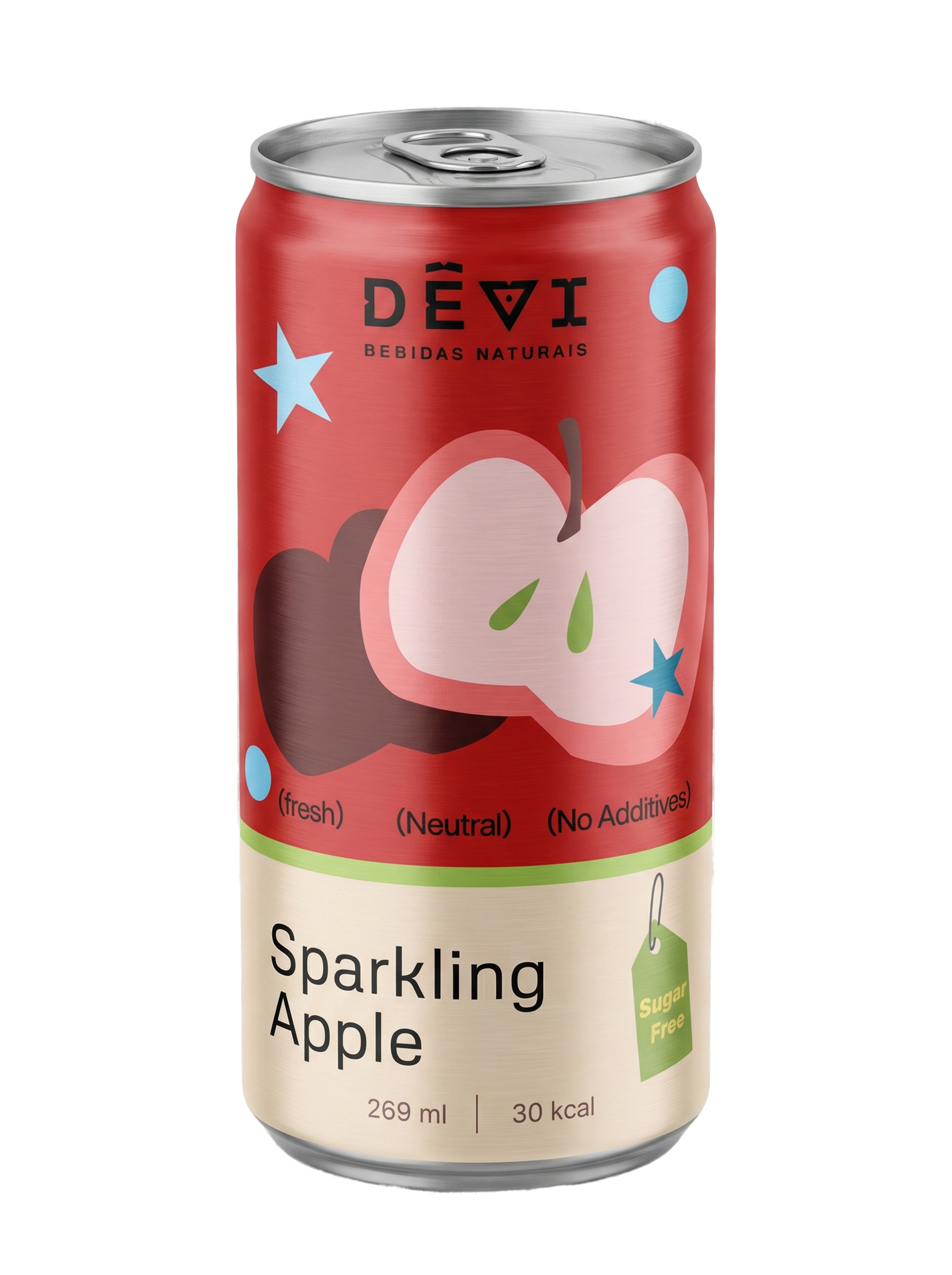
Apple Flavor
The apple can uses deep red and pink contrast to emphasize a crisp, lively taste while keeping the illustration playful and graphic.
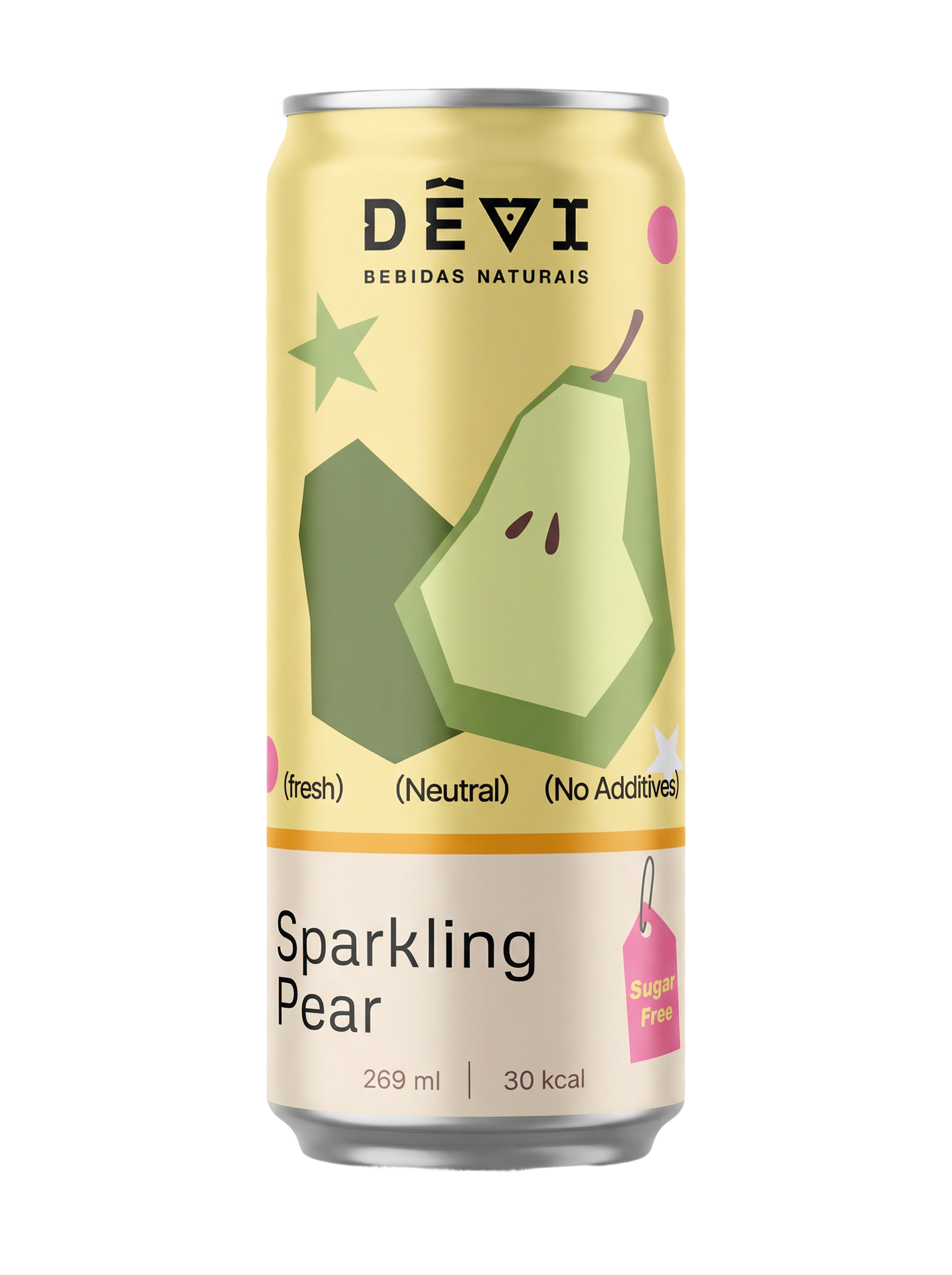
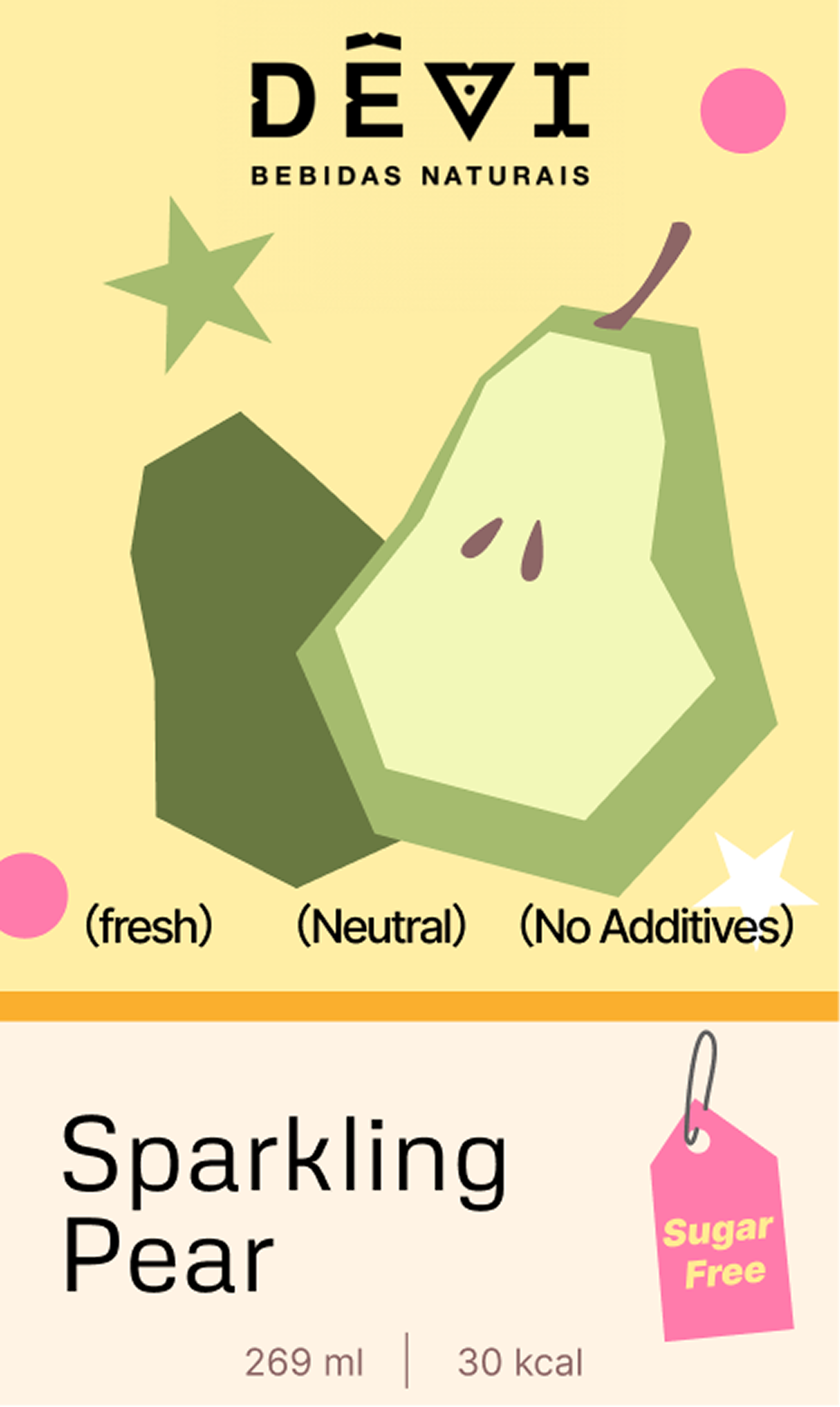
Pear Flavor
Soft yellow and olive green create a gentle palette for pear, balancing freshness with a lighter, more mellow personality.
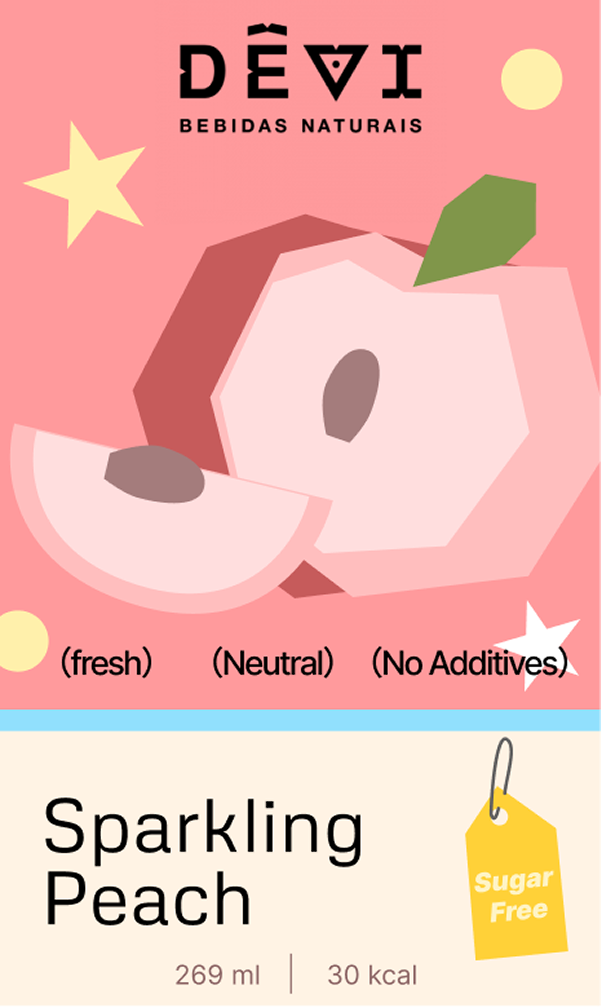
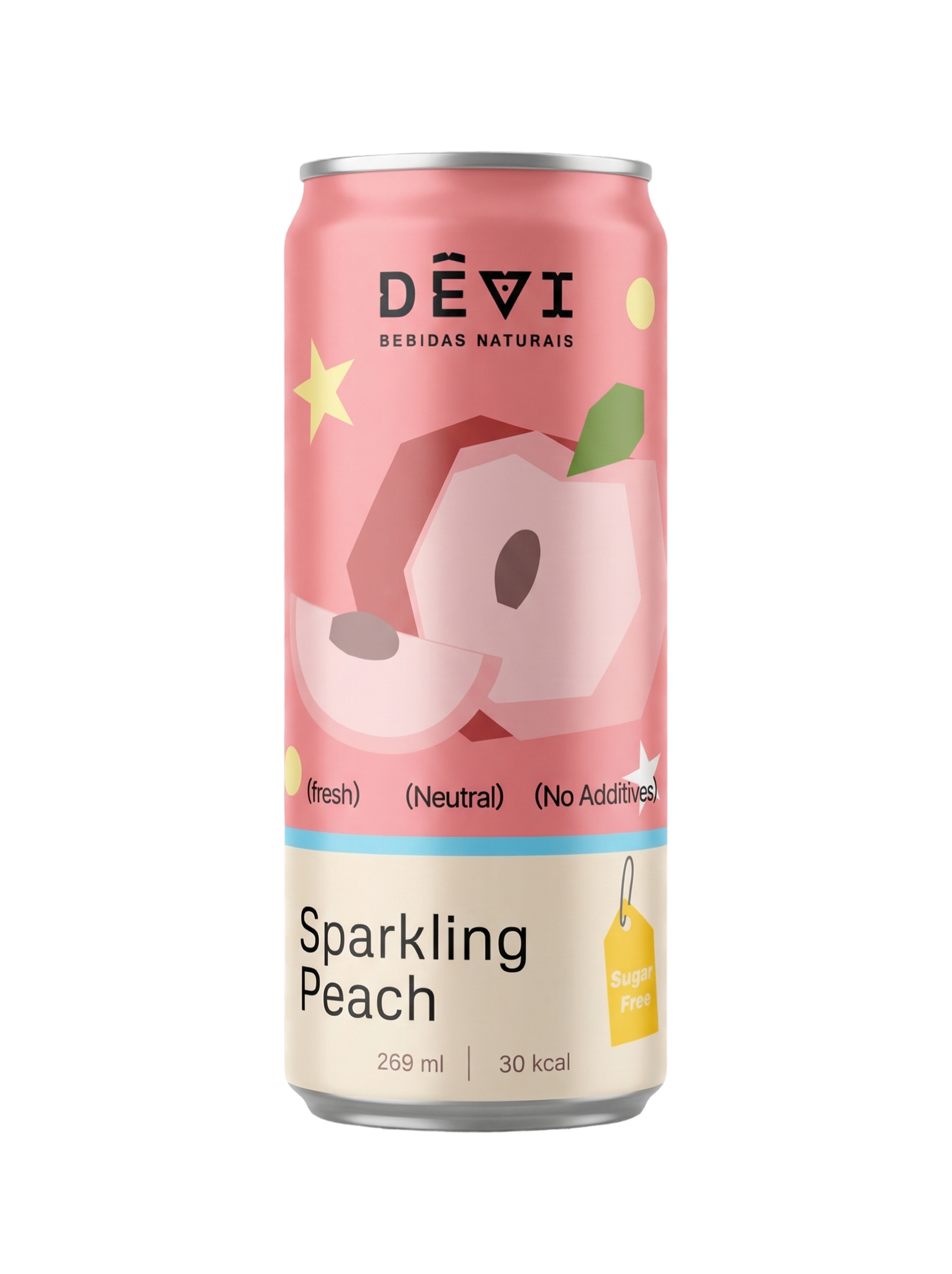
Peach Flavor
Peach leans into warm blush tones and layered geometry to make the package feel sweet, bright, and slightly nostalgic.
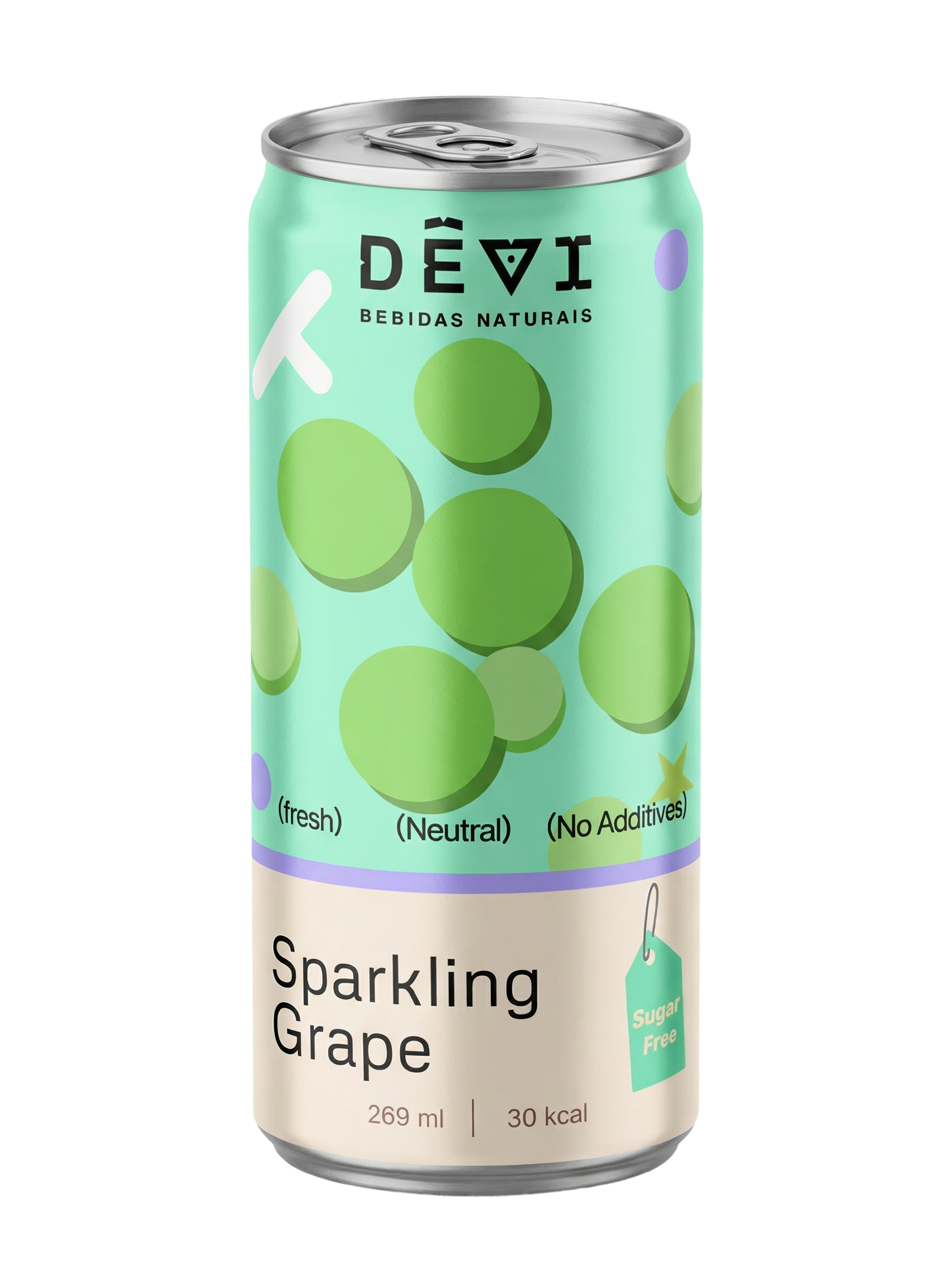
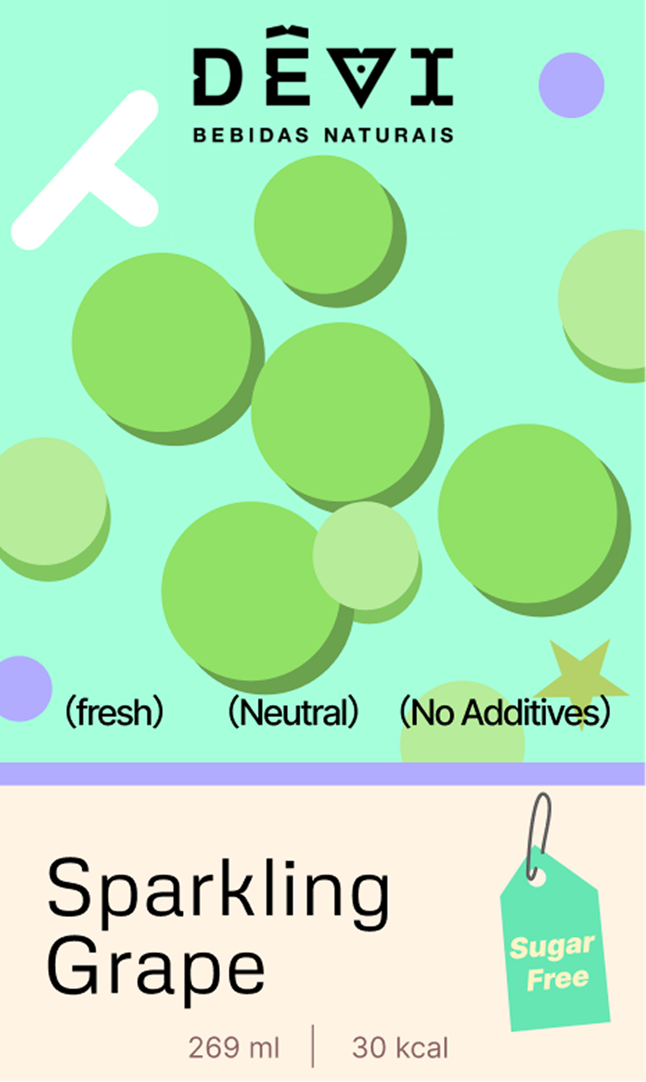
Grape Flavor
Rounded grape forms and mint tones bring a lighter rhythm to the set, helping the collection feel varied but still unified.